Typology Plate
Project Description
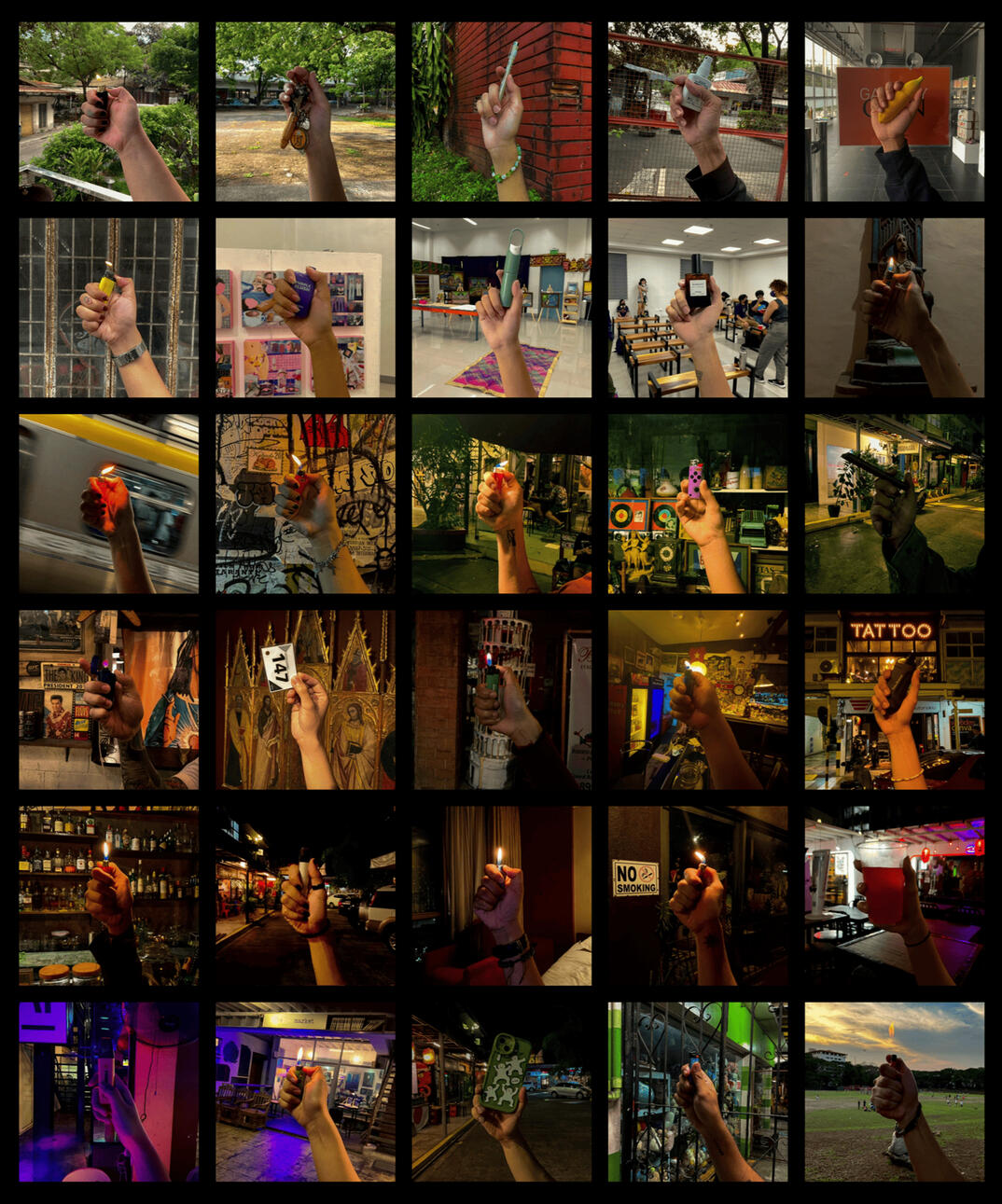
From the project title itself, the main guiding principle for the typology revolves around asking each subject the question “May lighter ka ba?” and in response to this a picture of the subject’s hand holding the lighter will be taken. In the occasion that the subject does not currently have a lighter, I will ask them to hold any object that they find fitting or something that responds to the question “Hi, May lighter ka ba?” The background must also be consistent as to where the subject has been asked or at least within a close radius.The project really came into fruition while I was walking home from class when I remembered the viral meme “Hi, May lighter ka ba?”

Typology Plate
Plate Making Process and Methodology
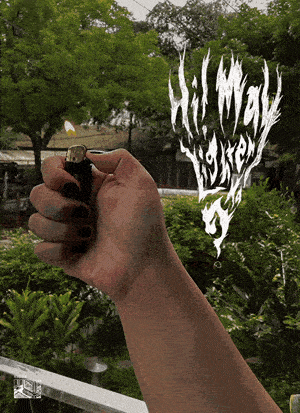
Gathering the photographs was the fun part but it had a bit of a learning curve when figuring out how to direct the subjects to perform a consistent pose, since some of the people who I asked I’ve met just for the project. During this part of the process, I’ve also decided to do some of the shoots at places where I might find individuals who actively smoked increasing the chances of having more lighters for the typology. There was a lot of getting used to in terms of technicalities but for the most part everyone was really nice and supportive of the project, I even had an encounter with “Luke Espiritu” a popular lawyer and labor leader who had ran for senator during the previous elections. It was nice to see how each picture had its own personality with objects and backgrounds really complimenting the hands that held them.During the editing and curation process, I’ve realized that a lot of the shots that I took earlier are either different in orientation and or do not fulfill the parameters of my guiding principle, so I did scrap a few of the earlier pictures and replaced them with some of the extras. Each picture had a different lighting and color scheme, so I had a bit of a hard time making them look consistent in post processing, but I did try to arrange each first by color to make the whole set more cohesive after each succeeding edit. Adding other enhancing effects like color grading and grain added more to the general look of the typology and having everything side by side with a black background for Instagram helped in binding everything together. Lastly, just to add more to the presentation, developing a gif of all the pictures together along with the custom typography I made helped in adding a bit more to the project’s execution.
miguellubagHi! I'm a student illustrator, artist and graphic designer based in Quezon City.My work mostly depict living spaces: rooms, houses, buildings, and landscapes each with their own unique narrative and style.Email: [email protected]